Your category pages are crucial! They help customers navigate your ecommerce website, and should intuitively guide users to things they want, resulting in sales.
To improve your store’s performance and maximize traffic online, spend some time implementing these seven SEO boosting steps:
1. Recognize category pages matter.
Sorting large quantities of information into manageable portions is a basic human function. In fact, famed child psychologist Jean Piaget considered categories (He called them schemas.) the building blocks of knowledge.
His research showed children learn by organizing their observations about the world into mental boxes; these observations continuously lead to future actions and influence decision making. Starting when? From birth!
Similarly, potential customers draw conclusions about your ecommerce store from the moment they arrive until the moment they bounce. If your category pages make it difficult to understand the value of your products or locate specific details about your items, you’ll likely witness high rates of lost sales.
It’s not enough to have a navigation bar. Your drop-down choices and navigation tabs have to lead customers to the pages they are actually looking for.
Recognizing that your category pages are important cornerstones that uphold the rest of your content is the first step towards maximizing your web traffic. Being intentional when creating them is key!
2. Avoid confusing names.
Confusing your users with trendy, unconventional category names is a huge mistake. Navigation tools are not for branded content.
As The Good Group explains in its article, “How to Design and Effective Ecommerce Category Page,”:
The Category Page must be both obvious and humble: Obvious, in that the choices it provides must stand out and be easily recognizable (this isn’t a page for obscurity). Humble, in that it must never draw attention to itself; rather, it must point clearly to the product categories it displays.
This means you should be naming your categories simply with terms your average customer already knows and understands. For example an online catering company would be wise to use a term like “Hors D’oeuvres” or “Small Plates” instead of something kitchy like “Soiree samples.”
Use more content-oriented pages on your ecommerce site to expound on your brand’s uniqueness.
Reserve category pages for helping your customers make decisions and move on; otherwise people may become frustrated by their inabilities to find what they need and go looking for the information elsewhere, even if you did have it on your site.
In addition to naming your category pages carefully, you’ll want to be sure you’ve trimmed down the quantity of categories as much as possible
.
Having too many to sort through can overwhelm your customers, so allow them to filter products based on their specific features within categories, not right at the onset of their shopping journeys.
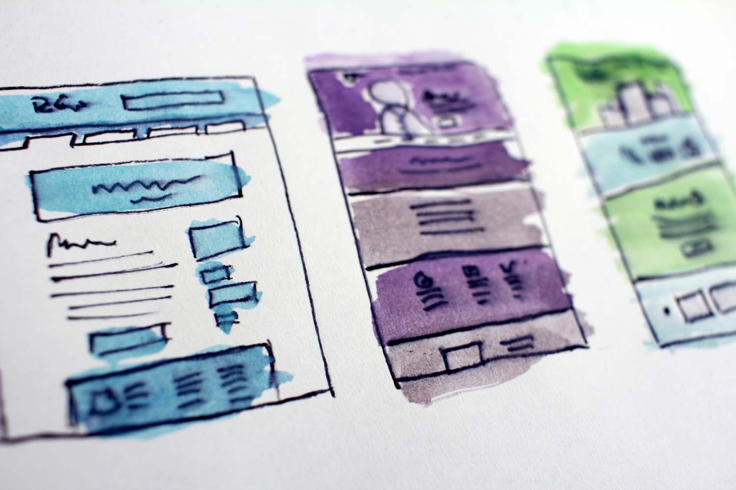
3. Reduce bounce rates with clear images.
After you’re comfortable with your navigation labels, consider adding graphics to your site menus. If a picture’s worth a thousand words, applying graphics to your navigation can only add clarification for users.
What sorts of images should you be placing on your category pages?
The Good Group advises that you choose “a generic image representing the entire category. Make it a hero image of the product by itself. The simpler and more obvious the better. The images should be consistent in size, but should stand out as different from one another. Guide the eyes and the minds will follow.”
Therefore, an online clothing shop would likely benefit from adding icons that depict a tshirt, jacket, dress, shoe, bag, etc. to each of its category pages. Doing so would add speed and efficiency to the store’s user experience.
By identifying the icon that matches their intended purchase, customers can easily find their desired product pages without exerting much effort at all.
They may not even need to read the category names at all during the navigation process, and the faster a customer finds his product, the faster you land a sale.
4. Apply A/B testing strategies.
Naturally, you’re not expected to be 100% sure which images or category page names your users will respond to best. Approach your ecommerce site renovations with this in mind, and embrace the fact that some trial and error testing is required.

By applying A/B testing methods to various aspects of your category pages, you can determine which choices statistically perform better for your sales conversion rates.
The dollars are in the details, but applying A/B strategies can feel intimidating for some ecommerce vendors. Check out these resources for more information and tips to help you maximize every aspect of your website without losing too much sleep to stress.
- “Tips for A/B Testing Category Pages” by Ecommerce Illustrated
- “What A/B Testing is and How to Use It” by Kentico (video)
- “The Complete Guide to A/B Testing” by VWO
- “How to Build a Strong A/B Testing Plan That Gets Results” by ConversionXL
- “7 Methods to Reduce Your Bounce Rate…” by Tekli
Still feeling lost? Contact the Tekli team for a free site consultation and ask what steps we can take to help you achieve your ecommerce goals!
5. Engage users to optimize your CTR.
Engaging with active users on your site is a great way to optimize your click through rate, ensuring customers don’t bounce before making that final purchase.
You can improve engagement by adding customer review fields, investing in quality photos, using pop-up features (carefully), and making category pages user friendly.
Reviews give your customers a chance to feel connected to your company by leaving their mark on it in a small way. Positive feedback encourages other customers to take that leap of faith at checkout, and negative feedback gives your valuable information about what sorts of improvements you need to be making to boost sales.
High-resolution photos also help customers feel comfortable making a purchase because you are communicating to them that quality matters; that mindset affects how these users perceive your products and make decisions about spending.
Using minimally a distracting pop-up feature like a discount code, customer service chatbox, or contact information form can also be extremely beneficial to your ecommerce store. The more you can collect data from and guide your customers, the better you can manage your site structure.
Lastly, engage your users and improve your CTR by doing everything possible to make using your website intuitive.
Truphae is one company you should definitely be looking to for inspiration on how to make the buyer’s experience pleasant and simple. Here’s a screenshot of their easy to navigate fountain pen category page:
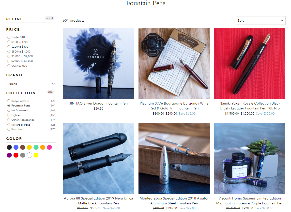
Their format is intuitive for users while utilizing many of the techniques mentioned in previous steps. Categories are clear, neatly organized, and easily refined.
With a clean layout and obvious set of product search filters, users are less likely to get overwhelmed and leave before submitting a payment.
6. Build Backlink to category pages for SEO equity.
Category pages should be treated as cornerstone content because all domain authority and trust flows from them and trickles down to product pages.
It’s a link juice concept, and if you’re new to the concept of link juice, Crazy Egg’s glossary conveys the idea pretty simply:
“If Page A links to Page B, then link juice “flows” from page A to page B and that generally helps page B rank higher on Google. The more pages (and the higher-quality the pages are) that links to page B, the more link juice page B has and the higher it will tend to rank on Google.”
In short, if Google considers your category pages to be authoritative, it boosts web-ranking for all of your respective product pages.
You can create this effect on your site by building strong backlinks to your category pages; be sure any press mentions of your company, blog pages, social media posts, etc. include backlinks to category pages, and better SEO will follow.
It also doesn’t hurt to build backlinks directly to your product pages!
7. Speed up your loading times.
Truth: even if your ecommerce category pages are perfectly named, designed, tested, engagement optimized, and coded, potential customers will still bounce if they feel your loading speeds are too long.
It’s the harsh reality of today’s need-it-now cultural mentality.
According to figures from Dotcom Monitor, “75% of all users will typically bounce as page load time passes the 3-second mark.” Essentially, this means your website’s ability to convert visitors into paying customers is heavily predicated on your site’s load speed.
The task may seem daunting, but if you tackle one thing at a time, you can see drastic improvements.

If you haven’t already, it’s time to set up website caching. Doing so will reduce bandwidth on your end and give your customers a more responsive experience.
Also, be sure to compress videos and images on your ecommerce site; failure to stay conservative with your file space will result in elongated loading times, and as we said before, users are unlikely to wait around for long.
Enable “lazy load” for your images. If you use Shopify for your ecommerce site, this is typically a default option. Make sure your saved image size is the same as your displayed image size, and reduce unnecessary plugins whenever possible.
Think of your site as a ship; extra weight is slowing you down, and the best way to pick up speed is to toss any useless junk overboard. Your profit records will thank you!
You’re well on your way to building top-notch category pages to maximize web traffic and upgrade your SEO status. Congratulations!
In review: Recognize category pages matter. Avoid confusing names. Reduce bounce rates with clear images. Apply A/B testing strategies. Engage users to optimize your CTR. Build Backlink to category pages for SEO equity, and Speed up your loading times.
Feel like you’ve mastered these skills? Check out other Tekli blog posts to learn new sales boosting tips, and don’t forget to share this post with other entrepreneurs in your life because business is better together.