Ever wondered if you could increase your marketing’s Click Through Rate (CTR) in a few easy steps? It may seem too good to be true, but using definite language can do just that.
Its easy to think you might be overlooking something right in front of you.
In the two case studies below we experimented with the language used in our CTAs—holding other variables constant. We ran our experiments with our client Stencil Stop, an ecommerce company that sells collegiate, regional, and custom stencils.
In the past, we observed that website visitors demonstrated a need for clarity whenever they were going to click a link to move from one webpage to another. Transitions take the form of internal or external links, moving traffic from landing page to another.
A:B Test 1: Home Page CTA Language:
In this case study, we experiment with the language on our homepage, above the fold call to action to see if more definite language gets a higher click through rate. In my opinion, the above the fold on the home page is the most important area of a website.
For another guide to creating above the fold CTA language that converts see Vital’s blog post on Mastering the CTA.
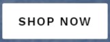
Control “Shop Now”
Vs.
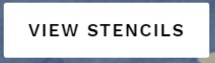
Test “View Stencils”
Initially, in prior iterations of the website, we assumed that our above the fold language, logo, and site name would make it clear what we are selling. I mean for Pete’s sake—the company is named “Stencil Stop”, what do you think they sell? Subsequently, to us it seemed obvious to us where a “Shop Now” button would take the visitor.
Despite this, our control Above the Fold and CTA was not producing the results I expected it should. The “Shop Now” iteration was seeing only a 20.1% click rate.
Our hypothesis was twofold: some context of what we conveying was lost in translation to new web visitors and that there was some inherent concern or perceived risk in clicking any link on an unfamiliar website.
The Result?
Our test, “View Stencils”, saw a 25% click rate from all web visitors, up from the 20.1% click rate on the control, “Shop Now”. This translated in a +24.4% increase in click rate.
In changing of only 2 crucial words our homepage was able to increase the clarity of the link transition, resulting in a +25% higher CTR.
A:B Test 2 – CTA Language in Email Newsletters
Here’s where things start to get really interesting…
After seeing the positive results in click-through rate, I decided to begin testing with how I could apply what we learned to our email campaigns. I suspected that the customer’s need for clarity would be even higher in this medium.
My reasoning for this assumption is based on the going concerns most people have with their inbox. Just about every internet user with any bit of savvy is aware and alert to the threat of phishing attacks and is adverse to clicking links in emails.
In this case study, we experiment with the language in email link. Both emails were sent with the intent of getting traffic to recently published blog posts.
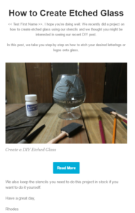
Control “Read More”
Vs.
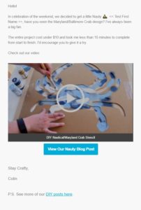
Test “View Our Nauty Blog Post”
And here are the results…
Regarding our Control, “Read More”, 6.6% of the individuals who opened our email clicked the link. Our test, “View Our Nauty Blog Post”, saw a 14.1% click rate by individuals who opened the email—a 214% increase.
This is a wild result derived from changing the button language.
Our Conclusion
Based off our results, I expect most email users do so with a mild degree apprehension. They are concerned of having one ‘pulled over them’ on email. This apprehension may or may not be rational—that’s not the point.
It makes sense when you think about it. We are constantly bombarded with news stories about hacking, identity theft, phishing and the like. Email is an area focus with regard to cybersecurity.
The point is in using email we have a risk-reward concept that is imbalanced. As a marketer, it is your job to ease the assessment of risk by carefully managing your potential customer expectations.
As you move email subscribers through your sales funnel, you will see much better results by managing all perceived risks by describing, in concrete terms, what they can expect in moving through the transitions you put in front of them.
The effects are clear.
With that, I leave you with a few questions:
- Where could your website or app be clearer, particularly regarding transitions?
- Does clarity for your audience mean what you think it does?
- Beyond just language used, how can you incorporate visual ques or media to increase CTR?
For another Case Study on increasing conversion rate, see our recent post on A:B Testing Gentech Nutrition.
I’d love to hear about how you’ve increased your conversion rate in your A:B tests. Send me an email at [email protected].